PKNG 10 Poster

Screenshot 2018-07-26 18.04.37.png
Type composition for the PKNG10 Poster (first color pass, video still)

Back in October 2017, our good friend and excellent graphic designer Claúdio Rodrigues from OOF studio invited us to design and print the poster for the 10th edition of the Pecha Kucha Night at Guimarães (PKN·G 10).

Catarina promptly agreed and suggested we did something with the poster layout we designed (and presented) for the ATypI exhibition. Although Marta and I had very limited availability, she swiftly suggested a preliminary layout. Continue reading “PKNG 10 Poster”
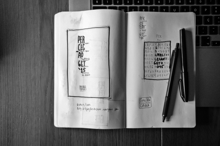
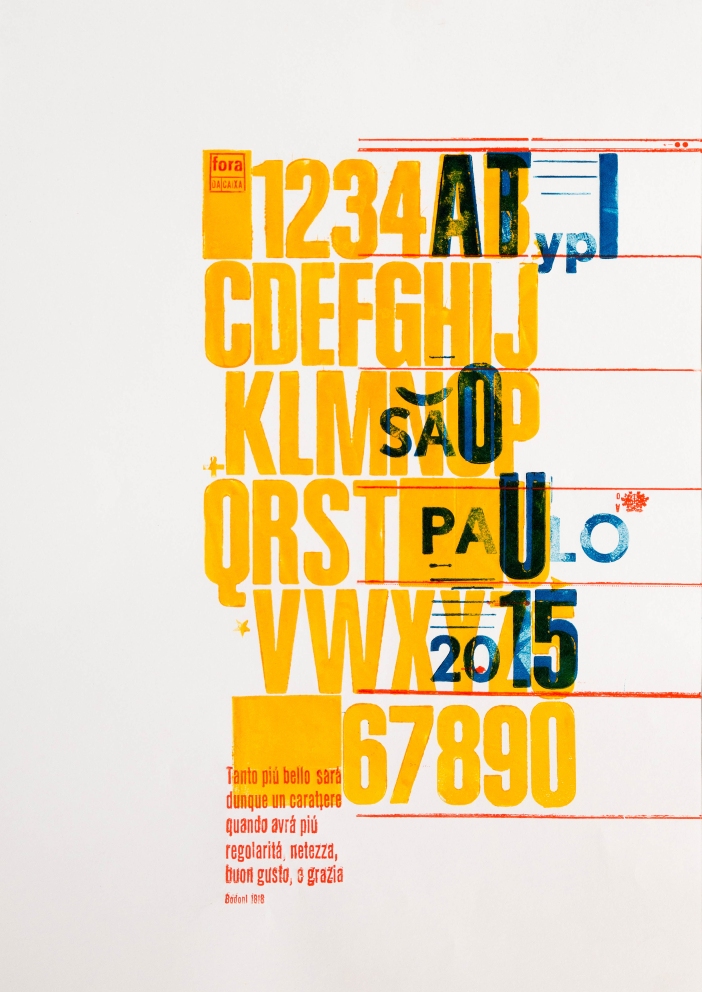
Regolaritá & Netezza

This is how the final poster ended up looking like.

Regolaritá & Nettezza. ATypI 2015 Letterpress Reloaded! poster submission
Regolaritá & Netezza. ATypI 2015 Letterpress Reloaded! poster submission

These posters were all hand printed on a (Grafopel) manual 40 x 50 cm proofing press.

The type specimen was printed using a used set of resalite Headline Bold Condensed, 130pt. These were acquired in an Arcozelo (Gaia) printing house.

The additional “São Paulo…” letters were printed using a used set of unknown 72pt lead grotesque font, acquired in Espinho.

The Bodoni quote was printed in a current lead 14 & 10pt condensed sans. We are calling it current, because this was the denomination used in the old printing house we’ve acquired these in Viana do Castelo.

The 25 posters were printed on an A3 (27,9 x 42 cm) 120g/m2 white paper using Process Yellow, Blue and Red colors lent by the Passos Manuel printing house.